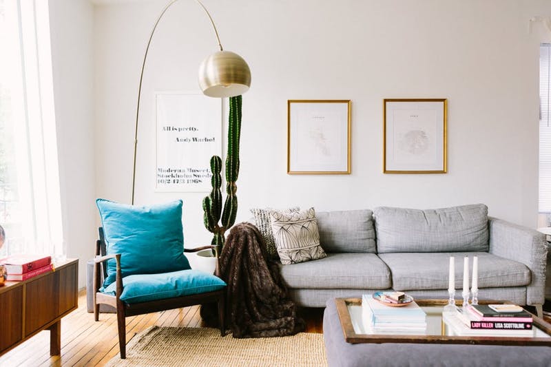
Function, flow and focus are three things to keep in mind.
Here at Apartment Therapy, we’ve been banging on about furniture placement for years, and it seems we’ve got a lot to say on the topic. Between all the advice, visuals and case studies, there are some gems of information to be discovered. Read on for our top 10 tips for nailing your furniture layout, with links to our archives to expand on each one.
1. Function Over Form
The most important factor when arranging any room is to understand, and have the layout reflect, how the space will be used. For example: two sofas facing each other is pleasantly symmetrical but, if your primary activity when sitting on said sofa is watching the TV, not ideal. Think about what you’d like to do in the space, what needs to be within arm’s reach, and how much room you’ll need.
2. Always Allow For Flow
An empty room is the best kind of blank slate for interior design junkies. But once you get furniture in there and start to arrange it, what seemed like a lot of opportunity can suddenly feel oppressive. Map your traffic routes, remember that less is more, and stick to at least three feet of “walking room” between pieces.

(Image credit: Nate Berkus Interiors)
3. Balance is Key
Whether you’re into symmetry in design or not, balance is important in any space. Visually counteract a large piece of furniture with two smaller ones, or a tall floor lamp with a hanging pendant. Get color and pattern in on the balance game and you’ll be feeling Zen in no time.
4. Every Seat Gets a Buddy
There’s something oddly lonely about a cozy armchair or loveseat just hanging out by itself. What is one going to do there (see first point)? Wherever you have somewhere comfortable to sit, make sure there’s also a surface on which to rest a cup of tea, a light to read by, or at the very least a buddy chair, so two people can sit and chat together.
5. Create Zones
In an open-plan space, you can use your furniture arrangement to create cozy “rooms” and designate areas for specific use. A rug under a group of chairs makes a conversation zone, an eye-catching chandelier over a table makes a dining area, and simply turning a sofa with its back to the rest of the room says “this is a living room.”
6. Don’t be a Wallflower
We’ve been saying this one long enough that it shouldn’t come as a surprise: except in the smallest of rooms (with anticipation of dance parties), there’s no need to push all your furniture up against the walls. Even giving a sofa 12 inches of breathing room can create the illusion of a larger, airier space.
7. Keep the Horizon Clear
When wanting to increase the sense of space, it’s important to keep the eyelines across a room clear. This doesn’t mean using low furniture in all cases (how boring!) but paying special attention to items placed in front of windows, and directly in front of the traffic path when entering a room. Apart from that, it’s fair game to play with height.
8. Find a Focus
While I don’t think every room needs a huge pendant lamp, quirky wallpaper or eye-catching piece of art, I do think it’s important to orient your furniture to make the best use of what your home does have. This might mean keeping the view of an ornate fireplace clear, arranging furniture to take advantage of beautiful views from a window, or keeping furniture low to show off period panelling.
9. Experiment
One of the best things about arranging a room? It’s just furniture. Many of us get stuck into one layout, and convince ourselves it’s the only way our home will work. But often moving a chair, shifting a sofa or re-orienting a bed is enough to give your home a whole new lease on life.
10. Loosen Up (& Remember it’s Your Home)
You can read as many “commandments” as you like, but remember: nobody has to live in your home but you. Every rule can be broken with some creativity and every home can be beautiful and welcoming with a little care. Experiment with your layout; who knows what might happen?

(Image credit: Esteban Cortez)


